What Is the Difference Between CMYK and RGB for Printing?
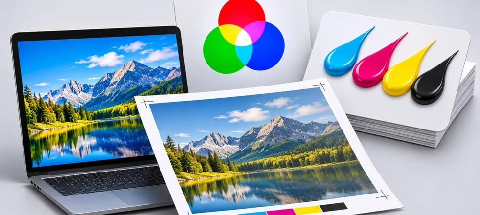
In graphic design and print production, a deep understanding of the nature of colour is a key skill for ensuring flawless print runs. The two dominant systems — additive RGB and subtractive CMYK — form the basis of colour management, but their areas of application differ fundamentally. Ignoring their basic principles inevitably leads to frustrating problems: crystal-clear, vibrant colours on a monitor can turn into dull, muddy tones in the physical print. To minimise such risks, it is necessary to study the underlying principles of each model in detail and learn how to apply them correctly in practice.
In essence, colour spaces are specialised digital languages that describe colours. Each system has its own characteristics, strengths and strict limitations. The choice of a particular model is determined by the final destination of the artwork: whether it will be displayed on a device screen or reproduced on a physical medium. There are many types of colour profiles, but for the vast majority of tasks, a designer needs to have a thorough understanding of RGB and CMYK in particular.
Traditional printing has historically been based on a subtractive colour space, while digital content creation is inseparably linked to the additive system. This fundamental distinction determines all the rules of pre-press preparation. Choosing the wrong profile at the outset guarantees colour distortion, loss of subtle gradations and, consequently, complete dissatisfaction with the result.
Characteristics of CMYK
The abbreviation comes from the names of the four basic printing inks: Cyan, Magenta, Yellow and Key colour (black). This system operates according to the subtractive principle, meaning that it is based on the subtraction of light waves. To put it simply, when external light falls on a printed sheet, certain parts of the spectrum are absorbed by the ink layer, while the remaining rays are reflected, forming a particular colour in the viewer's eye. The application process in this model involves distributing each pigment in separate layers. According to the laws of physics, overlapping yellow, cyan and magenta should produce a deep black, but in practice only a muddy brown tone is formed. For this reason, black ink (Key) is added to the equation. It is responsible for creating dense shadows, increasing contrast and simply reducing the amount of coloured ink required. Moreover, the black channel is responsible for printing text, as attempting to create black type from three coloured components is technically cumbersome and can result in blurred lettering.
In the printing industry, CMYK serves as the foundation for creating full-colour images on paper, board, plastic and other substrates. Regardless of whether offset, digital or flexographic printing is used, the principle remains the same: the image is separated into four independent channels. Each ink is transferred through its own printing unit, and the precision of their registration directly affects whether defects occur. The CMYK model has objective limitations in terms of colour gamut. Many neon, highly saturated and extremely bright tones — particularly vivid variations of blue and green — cannot be physically reproduced using four standard inks. This is dictated by the chemistry of the pigments and the optical properties of the materials. It follows that artwork created in RGB will inevitably lose some of its vibrancy when converted directly to CMYK. Experienced designers compensate for this factor from the outset by relying on specialised print colour references. The influence of paper must not be overlooked either. Smooth coated board reflects light exceptionally well, making colours appear bright, whereas porous uncoated paper absorbs ink, muting the shades. Surface texture also makes its own contribution. This is why, before starting a print run, it is critically important to order a colour proof on the very material that will be used for production. This is the only way to predict in advance how the inks will behave.
Characteristics of the RGB Colour Model
The abbreviation RGB stands for Red, Green and Blue. This architecture is based on the additive method of colour synthesis through the combination of light. This system serves as the universal standard for displaying graphics on the screens of all types of electronic devices, from PC monitors and televisions to smartphone displays and projectors. In RGB, colour is produced through the direct emission of light from a light source. The image is formed by combining light waves. When all three channels are mixed in equal proportions at maximum light intensity, pure white is produced. If the intensity of all three components is reduced to zero, the screen goes dark, becoming completely black. This is the fundamental difference from the subtractive model, in which combining all inks produces black, while the absence of ink means the white colour of the paper itself.
The vast majority of digital content is created exclusively in RGB. This includes mobile app interfaces, videos, websites and photographs for social media. Because a monitor physically emits light, the image appears incredibly bright and vibrant. But this visual effect can be deceptive: what looks perfect on a backlit display can change dramatically when physically transferred to an inert printed medium. Each of the three colour channels in the RGB system operates with values from 0 to 255, generating more than 16 million possible combinations. This range allows for smooth gradients and an extremely broad palette of tones. Light waves in the red, green and blue spectra, mixed in different proportions, create the entire available visible spectrum. For example, yellow is produced by combining red and green, magenta by combining red and blue, and cyan by combining green and blue. The hardware characteristics of monitors are also inseparably linked to the RGB model. Different screens display colours differently because of variations in panel types, backlighting quality and factory settings. For this reason, the same file can look completely different on two adjacent monitors. For professional colour work, hardware calibration of the display using a colourimeter is critically important, as it allows the screen's output to be brought into line with uniform standardised values.
Key Differences Between the Colour Models
These differences are determined by their physical nature and areas of application. Understanding them helps to select the correct settings for each project and avoid problems when files are transferred to production.
Physical Principle
The RGB model operates according to an additive principle, in which colour is created by combining light rays. The more light we add, the lighter the image becomes, up to pure white. CMYK, by contrast, is subtractive. Here, colour is formed by subtracting (absorbing) parts of the light spectrum through the inks. The more layers of ink we apply, the darker the image becomes, ultimately reaching black. This physical polarity determines all the other nuances of working with colour.
Colour Gamut
The colour gamut of the RGB model is objectively wider than that of the printing standard. This is particularly noticeable when working with extremely bright and saturated tones. Many colours that we can easily see on a display do not physically exist within the range of four printing inks. When a file is converted from RGB to CMYK, the algorithm automatically selects the closest equivalents from the available palette. This inevitably leads to a reduction in overall brightness and a distortion of the original concept. The reason is simple: the light emitted by monitor pixels is inherently more saturated than light reflected from physical pigments on paper.
Purpose
The additive model (RGB) was created for digital content: web design, interfaces, video graphics and presentations. The CMYK model is designed for print: business cards, brochures, packaging and outdoor banners. Attempting to combine these areas guarantees errors: a file created in RGB and sent to print without conversion will produce an unpredictable and often illegible result. Therefore, the choice of colour profile should be made at the very beginning of creating a new document.
Technical Implementation
In RGB, each image pixel stores information about three light-emitting channels. The CMYK model has four channels. This makes the printing process considerably more complex, as it requires precise registration of four printing forms. Any, even microscopic, displacement of a form will result in coloured halos (doubling) or loss of edge sharpness.
Colour Perception
Colour on a monitor screen is formed through direct light emission, so it appears sufficiently bright even in complete darkness. Colour on a printed sheet depends entirely on the ambient light and the paper's reflectance. The same shade will be perceived completely differently in daylight, under a warm incandescent lamp or in deep shadow. This factor must be taken into account when evaluating colour proofs and approving the main print run.
Conversion
Converting an image from RGB to CMYK is an irreversible process accompanied by data loss. Some colours simply have no physical equivalents in the print palette and are permanently lost. Reverse conversion (CMYK to RGB) is technically possible, but it also cannot restore lost colours, merely stretching the existing ones. Therefore, the golden rule is: work in the colour space that corresponds to the final medium.
How to Minimise Differences Between CMYK and RGB
Despite their fundamental differences, there are practical ways to reduce discrepancies between colours on screen and in print. A professional approach to preparing artwork can help achieve a predictable result.
Work in the Correct Colour Model
When a physical print run is expected as the final output, the document should be created exclusively in the CMYK colour space. This approach allows you to see the colours in their printed form from the outset, avoiding unpleasant surprises during automatic conversion. Advanced graphics editors such as Adobe Photoshop and Illustrator offer convenient tools for changing colour profiles and activating preview modes.
Use a Calibrated Monitor
Screens on different devices display colours with noticeable variations. Professional monitor calibration using a colourimeter provides reference-level accuracy and brings the on-screen image as close as possible to the actual printed result. For specialists who work extensively with print, this is not simply a recommendation but an essential requirement. Regularly checking the display settings helps maintain consistency throughout the entire workflow.
Work with Colour Profiles
Applying the correct ICC profile in the design software settings makes it possible to simulate the final appearance of the printed sheet in advance, minimising the gap between the on-screen artwork and reality. Many modern printing companies are happy to provide their own colour profiles to clients, which significantly simplifies pre-press preparation.
Produce a Colour Proof
A colour proof is a test print that clearly demonstrates what the finished product will look like. Comparing the reference proof with the image on the monitor helps identify and correct critical discrepancies. This procedure is strictly necessary for projects with demanding colour-reproduction requirements, such as packaging or corporate identity development.
Select Colours from Print Colour References
Instead of intuitively selecting shades by eye in a digital editor, rely on specialised colour libraries optimised for print, such as Pantone colour guides. These colour references contain precise values for both models, which greatly simplifies the transition from screen to paper. The base colours in such systems have already been mathematically adapted for accurate reproduction in print.
Consider the Paper Type
Different types of paper have unique absorption properties and light-reflection coefficients. Coated surfaces produce brighter and more contrast-rich colours, whereas uncoated papers make the palette more subdued and softer. When preparing artwork, it is necessary to know in advance which material the print run will be produced on and, if necessary, make appropriate colour adjustments. Consult a Printing Specialist Printing-production specialists have extensive experience and a range of equipment for accurate colour reproduction. Discussing the technical requirements for the artwork at the earliest stages helps avoid serious errors and costly reworking. Printing technicians can recommend optimal software settings, suitable colour profiles and quality-control methods.
Test Critical Colours
If the design contains particularly important shades, such as a strict corporate brand colour, print them as separate colour swatches on the target material before starting the main print run. This will allow you to be 100% certain that the selected colour is reproduced correctly and fully meets the client's expectations. A thorough understanding of the differences between the CMYK and RGB colour models is an essential requirement for creating flawless printed products and high-quality digital content. Making the right choice at the project-planning stage saves a considerable amount of time, financial resources and unnecessary stress. It is important to remember that an absolute, 100% perfect match cannot be achieved because of the fundamental physical differences between emitted light and reflective ink. However, an expert approach can bring the result as close as possible to the desired outcome.