Tri-Fold vs Bi-Fold Brochures: How to Choose the Right Format
A brochure can contain all the right information and still be awkward to read. Sometimes the problem is not the copy or the design, but the way the sheet has been divided.
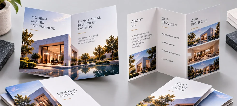
A bi-fold and a tri-fold create very different physical and visual formats. A bi-fold is folded once, creating four panels, while a tri-fold is folded twice, creating six. One gives you fewer, larger areas for content; the other creates more individual panels, making it easier to separate information into distinct sections.
That difference affects much more than appearance. It influences how much text can be used comfortably, how large photographs can be reproduced, how the reader moves through the information and how the finished brochure behaves when folded. The decision should therefore be made before the artwork is designed. Choosing a fold first and then trying to force the content into it is one of the easiest ways to end up with a brochure that feels either overcrowded or unnecessarily empty.
The Real Difference Is the Way Content Is Divided
A bi-fold is folded once, producing four panels. In a typical brochure, these become a front cover, back cover and two interior panels.
A tri-fold is folded twice, producing six panels. This provides more distinct areas for information, but each panel is narrower.
That gives the two formats different strengths.
A bi-fold is naturally suited to content that benefits from space and continuity. It allows larger images, broader text columns and more open compositions. A tri-fold is better suited to content that benefits from being divided into sections. Services, product categories, features, process stages or practical information can be separated into clearly defined sections.
The important point is that six panels do not automatically mean more useful space. They simply divide the available sheet differently.
If the content consists of four substantial ideas, a bi-fold may provide a cleaner structure. If it consists of several short, related sections, the additional panels of a tri-fold can make the information easier to navigate.
Think About the Reading Journey Before the Layout
The fold influences how the reader moves through the information.
A bi-fold often works well as a relatively simple narrative. The front introduces the subject, the interior spread develops the message, and the back provides supporting information or a contact point.
This can suit a company presentation, a concise service brochure, a product introduction or image-led sales material.
A tri-fold creates more of a sequence. Its panels can guide the reader through several stages or categories without requiring long uninterrupted passages.
For example, a corporate services brochure might introduce the company, present several service areas across the internal panels and finish with contact information and a QR code. This approach is particularly useful when readers are likely to scan the brochure rather than read every word.
However, the panel order should never be assumed from a generic template. The exact arrangement depends on how the sheet is folded, which panel becomes the cover and how the finished piece opens. The printer's folding specification should be established before the final artwork is prepared.
Where a Bi-Fold Has a Visual Advantage
Some content simply needs room.
Architectural photography, interiors, product photography, large diagrams and other visual material can benefit from the wider uninterrupted areas available in a bi-fold.
Fewer folds mean fewer physical interruptions to the composition. A photograph can occupy a substantial part of an interior spread without being broken into several narrow sections.
This is particularly useful when the brochure's purpose is to create a strong visual impression rather than communicate a large amount of information.
It also gives the designer more freedom with hierarchy. A headline can have generous surrounding space, supporting text can remain comfortably readable and images can be reproduced at a useful scale.
A tri-fold can certainly be highly visual, but the folds become part of the composition. Important details should not disappear into a crease, and photographs need to be positioned with the finished folding pattern in mind.
Why Tri-Folds Work Well for Structured Information
The strength of a tri-fold is not simply that it has six panels. It is that those panels can give separate pieces of information their own physical territory.
Imagine a brochure for a company exhibiting at a Dubai trade show. Instead of placing every service on one large spread, the brochure could introduce the business, give each major service or solution its own section, and finish with contact details and a QR code.
The reader can quickly identify the relevant area without having to work through a long continuous text block.
The same principle can work for hospitality, real estate, education, tourism, corporate services and product ranges.
But the sections need to be meaningful.
If the content does not naturally divide into several categories, creating six sections merely because the format has six panels will make the brochure feel fragmented. A tri-fold is strongest when the information is genuinely modular.
Content Volume and Panel Width
The amount of copy can be one of the most useful tests to make before design begins.
Take all the information that genuinely needs to appear in the brochure and group related material together. Include the main proposition, service or product descriptions, images, specifications, contact information and any essential practical details.
Then look at the natural number of content groups.
If there are a few substantial sections that need room to breathe, a bi-fold may provide the better canvas. If there are several concise sections that readers may want to find independently, a tri-fold may organise them more effectively.
This exercise can also reveal that there is simply too much content to fit comfortably into either format. That is a content problem, not a folding problem.
A brochure does not need to contain every detail about a company or product. It may only need to establish relevance and direct the reader towards the next step — a website, enquiry, sales conversation, booking or QR-linked resource.
The physical width of each panel also has a direct effect on typography. Tri-fold panels are relatively narrow, so long paragraphs can become uncomfortable to read. The temptation is to reduce the type size until everything fits.
A better solution is to edit the content before reducing the typography. Shorter paragraphs, clear subheadings, concise descriptions and deliberate spacing usually produce a stronger brochure than simply fitting more words onto the page.
A bi-fold gives more horizontal space, but that does not make it suitable for unlimited copy. Large panels filled with dense paragraphs can look more like a folded report than a marketing brochure.
The format should determine the structure and amount of information, not dictate that every available area must be filled.
The Finished Size Matters More Than the Unfolded Sheet
A brochure is designed on a flat sheet but experienced as a folded object.
An A4 sheet folded in half produces four A5 panels. The same A4 sheet folded into thirds produces six narrower panels.
Both use the same sheet size, but they feel completely different when handled.
This matters when the brochure needs to fit into a presentation folder, envelope, exhibition bag or pocket. It also matters where the finished piece will be displayed.
A brochure intended to sit on a reception desk may need a different balance of size and stability from one designed to be handed out at an exhibition.
The distribution method should therefore be considered at the same time as the fold.
The Fold Is a Production Specification
One of the most important details is often overlooked during design: with some folding constructions, the panels are not intended to be exactly the same width.
One panel may need to be slightly narrower than the others so that the sheet closes neatly. This becomes more significant as paper thickness increases.
If all three panels of a tri-fold are treated as mathematically identical when the production specification requires a different arrangement, the finished piece may not fold cleanly. The result can be subtle but noticeable: a panel may push against another panel, the edges may not align as expected, or the brochure may develop an uneven appearance when closed.
This is why the folding template should come from the printer rather than being improvised in the design file.
The same principle applies to important design elements. A logo, face, product detail, small text block or fine line placed too close to a fold can become visually compromised once the sheet is finished.
Paper Thickness Changes the Behaviour of the Fold
The choice of stock is closely connected to the folding method.
Lightweight papers are generally easier to fold cleanly. Heavier stocks create a more pronounced fold and may require additional production considerations.
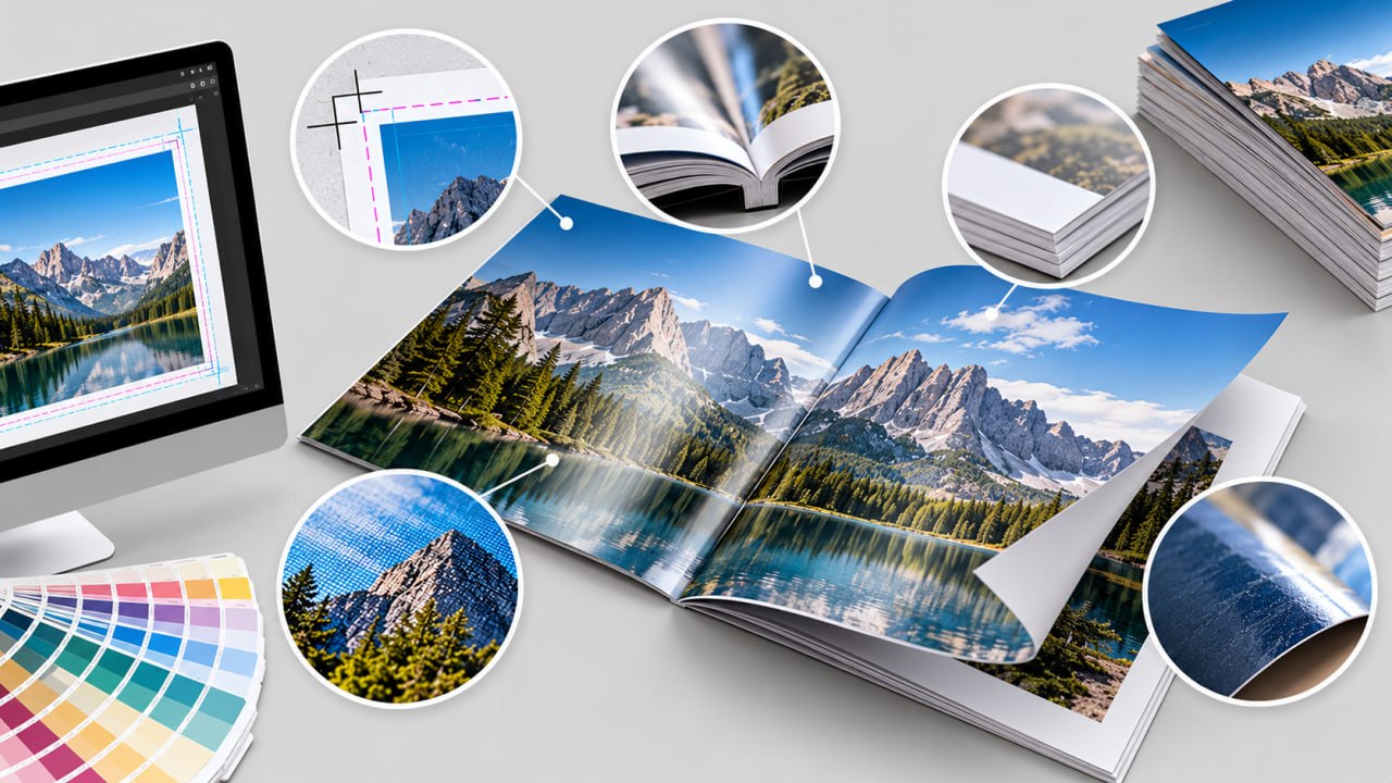
With some coated papers, particularly at higher grammages, scoring before folding can help reduce cracking along the fold. This is especially relevant when the brochure uses a substantial premium stock or when the printed area extends close to the crease.
The effect is not purely technical. A poorly controlled fold can affect the perceived quality of an otherwise excellent brochure.
Paper, coating, ink coverage and finishing should therefore be considered together rather than specified independently.
Consider How the Brochure Will Actually Be Used
The same content can justify different formats in different situations.
At a busy exhibition, visitors may scan printed material quickly while standing. A tri-fold can make separate services or product categories easy to locate.
During a sales meeting, a bi-fold can provide a broad interior spread that is comfortable to discuss across a table.
For a brochure displayed at reception, the closed size and ease of handling may matter more than the number of panels.
For mailing, the finished dimensions may need to work with an envelope or packaging format.
The physical environment is part of the design brief.
A Practical Decision Before Design Begins
Before the artwork is started, define the brochure in terms of its actual job.
How much information must the reader absorb?
Which pieces of information belong together?
Do photographs or diagrams need substantial uninterrupted space?
Will the brochure be read sequentially or scanned for individual sections?
What should its finished dimensions be?
Where will it be handed out, displayed, mailed or stored?
What paper and thickness are appropriate for the required fold?
Does the folding construction require a specific panel width or scoring?
Which elements must stay safely away from the fold?
These questions usually make the choice much clearer.
A bi-fold tends to suit concise, visual content that benefits from larger panels, broad compositions and a relatively open reading experience.
A tri-fold tends to suit modular information that can be divided into several short, clearly defined sections.
Neither format is inherently more professional or more effective. The result depends on whether the fold, content, design and production specifications have been planned as one system.
The best brochure is not the one with the most panels. It is the one in which every panel has a reason to exist.