Product Label Printing: Choosing Materials, Sizes and Finishes
A product label has to do much more than carry a logo and product information. It must suit the packaging, adhere reliably, remain legible, withstand the conditions in which the product is stored and handled, and present the brand appropriately at the point of sale. That makes label specification a production decision as much as a design decision. The right material, adhesive, size and finish depend on the product, the packaging, the application method and the environment in which the finished label will be used.
Start with the Packaging
The shape and surface of the container determine many of the label's practical requirements.
A flat carton is relatively straightforward. A narrow bottle, curved jar or flexible pouch introduces other considerations, including the available surface area, curvature, edge behaviour and the way the label will conform to the package.
Before deciding on the label size or material, establish:
- what the packaging is made from;
- whether the surface is flat, curved or flexible;
- how much usable space is available;
- whether the product will be exposed to moisture, condensation or temperature changes;
- how the label will be applied;
- whether the label needs to be permanent or removable.
The packaging should therefore be treated as part of the label specification from the beginning, rather than as a constraint discovered after the artwork has been prepared.
Paper or Synthetic Material?
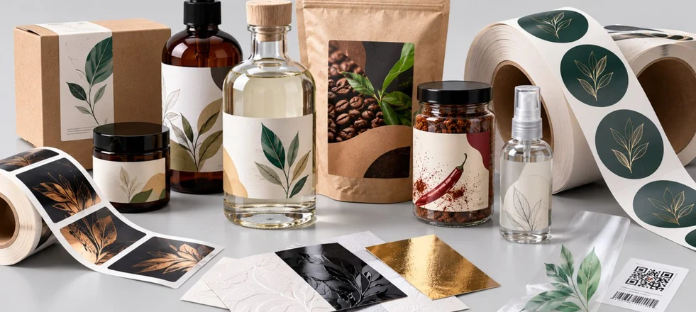
Paper is an excellent choice for many products, particularly when the label's main role is to communicate information and establish the visual character of the packaging. The choice of paper surface can make a substantial difference. A smooth coated stock can reproduce detailed graphics and strong colours cleanly, while an uncoated or textured stock can give the label a more tactile and natural character.
Synthetic materials become more relevant when resistance to moisture, handling or demanding storage conditions is important. Polypropylene, for example, is commonly considered for products exposed to condensation, refrigeration or frequent contact with liquids.
There is no universally superior substrate. The appropriate material is the one that performs reliably on the intended packaging and under the conditions the product will encounter.
The Adhesive Is Part of the Specification
The face material is usually the most visible part of a label, but the adhesive determines whether the finished label will remain where it is supposed to. Permanent and removable adhesives serve different purposes, and their performance can also vary according to the surface. Glass, plastic, cardboard and other packaging materials do not necessarily present the same conditions for adhesion.
Curved containers require particular attention. A label that performs well on a flat carton may behave differently around a narrow bottle or another surface with a small radius. Storage conditions also matter. Refrigeration, condensation and temperature changes can affect adhesion, so these factors should be established before production rather than becoming a problem afterwards.
Choose the Size Around the Information
The largest possible label is not automatically the most effective, while making a label smaller does not necessarily make the packaging look more refined. Begin by establishing what the label needs to communicate: the product name, variant, ingredients, weight or volume, manufacturer information, barcode, QR code and any other required details. These elements then need to be organised according to their importance and the space available.
If the format becomes too small, continually reducing the type size is rarely the best solution. A slightly different label shape or proportion may create enough space to preserve readability without making the packaging feel crowded.
Curved containers introduce another limitation. A label that is too wide for a tight curve may not sit cleanly, particularly towards the edges. Its dimensions therefore need to work with the geometry of the packaging as well as with the artwork.
Transparent Labels Require Different Colour Planning
Transparent labels can create a clean, almost label-free appearance by allowing the packaging itself to remain visible. They also change the way colour behaves. The surface behind the label becomes part of the visual composition, so light colours may lose density and printed elements may appear differently over clear glass, coloured contents or other graphics. White ink can be printed as a separate layer where greater opacity is required. It can strengthen lighter colours, create solid white areas or allow opaque and transparent elements to be combined within the same design.
For that reason, transparent labels should be assessed on the intended packaging whenever colour, opacity or legibility is important. A design that looks correct on a white screen background may behave quite differently when printed on a transparent substrate.
Reserve Space for Barcodes and QR Codes
Functional information should be considered at the beginning of the design rather than added to whatever space remains at the end. Barcodes need adequate contrast and a clear area around the code. QR codes also require sufficient physical space to remain reliably scannable. Small labels can become particularly challenging when codes are combined with dark backgrounds, transparent materials, metallic effects or highly reflective finishes. The safest approach is to reserve the required area for functional codes before the visual composition is finalised.
Shape and Application Method Matter
A standard rectangular label is often the simplest solution, but a custom shape can be appropriate when it supports the packaging or the brand concept. The more important question is how the label will actually be applied. For manual application, the production requirements are generally straightforward. Automatic labelling introduces additional specifications, which may include:
- winding direction;
- label orientation;
- spacing between labels;
- core diameter; maximum roll diameter;
- feeding direction;
- compatibility with the application equipment.
These details should be confirmed before printing. A label can be correctly printed and finished yet still cause problems if its roll configuration does not match the labelling machine.
Choose the Finish with the Material
Finishing should support the purpose and character of the label rather than simply add more visual effects. A matte surface reduces reflections and generally creates a quieter appearance. A gloss finish reflects more light and can make colours appear more vivid. A soft-touch finish adds a distinctive tactile quality. Lamination can provide additional protection against handling and surface wear, but it also changes the appearance and feel of the material. If the character of a textured or natural paper is central to the packaging design, covering it with film may work against that intention.
Special effects can be used selectively:
- foil stamping introduces a metallic accent;
- spot UV creates contrast between glossy and non-glossy areas;
- embossing adds physical relief and a tactile element.
Several techniques can be combined, but more finishing does not automatically produce a better label. The substrate, artwork and finishing processes need to function as one coherent specification.
Prepare the Artwork Around the Production Process
A label is a physical product, so the artwork needs to accommodate the way it will be manufactured. Depending on the specification, the file may need to account for:
- bleed and safe areas;
- the cutting shape;
- foil areas;
- embossing or debossing;
- spot UV layers;
- barcode and QR-code placement; transparent areas;
- registration between printing and finishing.
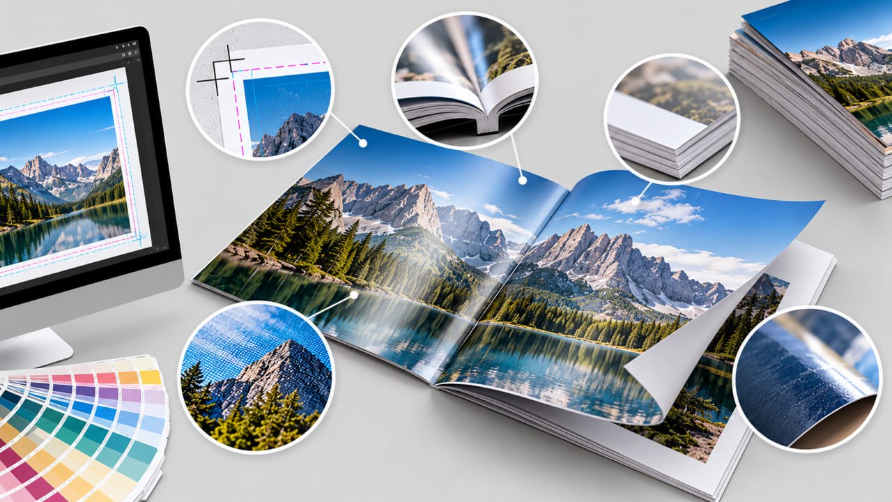
The design should also be assessed at its actual production size. Fine lines, small type and tiny decorative details can look convincing when enlarged on screen but lose clarity when reproduced at the final label size. A production-ready design is therefore not simply a visually finished design. It is one that has been developed with the physical manufacturing process in mind.
A Practical Order for Specifying a Product Label
Before requesting a quotation or approving the artwork, establish the specification in a logical order:
What is being labelled? Identify the product and packaging.
Where will the label be used? Consider moisture, refrigeration, condensation, friction and temperature changes.
How will it be applied? Determine whether application is manual or automatic and, if machinery is involved, obtain its relevant specifications.
What information must it carry? Allow sufficient space for required information, barcodes and QR codes.
What should it look and feel like? Choose the substrate and overall visual character before adding decorative effects.
How much will be produced? Consider the initial quantity and whether repeat production is likely.
This sequence helps prevent a common production problem: selecting the material, artwork and finishing independently and discovering only later that they do not work well together.