Print Finishing Explained: Lamination, Foil, UV, Embossing and More
A printed piece is shaped by more than the image produced on the press. The paper, surface treatment, structure and finishing processes all affect how the finished material looks, feels and performs in use. A brochure may reproduce photographs beautifully but still need protection against frequent handling. A business card may have a clean design yet feel unremarkable because there is no tactile contrast. Packaging may have strong graphics but need a particular shape, texture or visual accent to make an important element stand out. This is where print finishing becomes part of the design rather than something added at the end.
Lamination, spot UV, foil stamping, embossing, die cutting, creasing, folding and binding all solve different problems. Some protect the surface, some create contrast or texture, while others determine the physical form or usability of the finished piece. The right choice depends on the paper, artwork, quantity, production method and, above all, what the printed item needs to achieve.
Start with the purpose, not the finish
The most useful question is not “Which finish looks premium?” but “What needs to change in the finished piece?” If a brochure will be handled repeatedly, surface protection may be more valuable than a decorative effect. If a logo needs to stand out, a small area of spot UV or foil may achieve more than covering the entire surface with additional treatments. If packaging needs a distinctive physical structure, die cutting is a functional part of the specification rather than a decorative extra.
Starting with the purpose also prevents a common mistake: combining several techniques simply because each one looks impressive on its own. Finishing works best when it supports the visual hierarchy of the design instead of competing with it.
Lamination: protection and surface character
Lamination applies a thin film to the printed surface. It is one of the most versatile finishing processes because it can influence both durability and appearance. Matt lamination reduces reflections and gives the surface a more restrained character. It is often well suited to corporate brochures, presentation folders, business cards and other materials where readability and a controlled appearance are important.
Gloss lamination creates a brighter, more reflective surface and can make photographs and saturated graphics appear more vivid. It can work particularly well for image-led brochures, promotional materials and other visually strong applications.
Soft-touch lamination provides a smooth, velvety feel that is experienced immediately when the material is handled. It can be effective for premium stationery, packaging and selected presentation materials, although its value depends on whether the tactile effect serves a genuine purpose. The choice should therefore be based on the finished product rather than the name of the film. Consider how often the item will be handled, where it will be used, whether glare is a concern and what the paper already contributes to the overall result.
Spot UV creates contrast
Spot UV is applied only to selected areas rather than across the whole surface. Its main strength is contrast. A gloss logo against a matt background can create a subtle change in reflection without introducing another colour. On a brochure cover, spot UV can highlight a product image, title or graphic detail while leaving the rest of the surface visually quiet.
The effect is usually stronger when it is selective. If too much of the design receives UV, the contrast that makes the technique effective begins to disappear. Spot UV also needs to be considered during artwork preparation. The coated areas normally require separate finishing information, and very small details or complex shapes need careful checking. When several processes are combined, accurate registration becomes increasingly important.
Foil stamping creates a physical metallic accent
Foil stamping transfers a thin layer of foil onto the surface using heat and pressure. Gold and silver are familiar choices, but modern foils are available in a much wider range of colours and effects. The key characteristic of foil is not simply its colour. It creates a reflective physical surface that interacts with light differently from printed ink. That makes foil particularly effective for:
- logos and monograms;
- product or brand names;
- packaging details;
- invitations and certificates;
- covers;
- selected graphic accents.
Foil is not automatically the best way to reproduce every metallic effect. A printed metallic colour may integrate more naturally into a large illustration or complex graphic, whereas foil can provide a sharper and more distinct accent. The substrate matters as well. A smooth coated stock and a heavily textured uncoated paper will produce different results even when the foil specification is otherwise identical. For demanding applications, the material and finishing process should therefore be considered together.
Embossing adds a tactile dimension
Embossing changes the physical surface of the printed piece by creating raised relief. Debossing produces the corresponding recessed effect. Unlike a purely visual treatment, embossing can be experienced through touch as well as sight. This makes it useful for logos, short titles, packaging details, stationery and covers where a physical element is part of the intended experience.
The artwork must suit the process. Very fine lines, tiny lettering and highly complicated shapes can lose definition when converted into physical relief. Paper structure and thickness also influence the result, so embossing should be specified alongside the substrate rather than as an isolated finishing decision.
Foil and embossing can be combined when both visual and tactile emphasis are wanted. A raised logo with foil across its surface, for example, creates a stronger physical presence than either treatment alone. That does not mean combining more processes automatically produces a better result. Every additional technique adds production stages and increases the number of details that need to register correctly. A single well-positioned foil or embossed element can be more effective than several competing effects.
Die cutting changes the shape of the finished piece
Die cutting is used when a printed sheet needs something other than a standard rectangular format. It can create custom outlines, windows, openings and more complex physical structures.
For packaging, die cutting is often part of the construction itself. The cutting pattern determines the shape of panels, flaps and other components that will later be folded and assembled.
For marketing materials, it can create distinctive cards, folders, tags, invitations or other shaped pieces.
The important point is that the cutting path is part of the product specification. It has to work with the artwork, folds, creases, glued areas and final assembly. Treating it as a decorative outline added after the design is complete can create unnecessary production problems.
Creasing and folding affect how the piece works
Some of the most important finishing operations are barely visible.
Creasing can help heavier paper fold cleanly and reduce the risk of cracking along the fold. Folding, meanwhile, needs to follow the physical structure of the item so that panels, text and images appear in the intended sequence.
This matters particularly for brochures, folders, cards and packaging. A folding pattern that looks straightforward on screen can behave differently once paper weight, coating and grain direction are taken into account.
The objective is not to make the finishing noticeable. It is to make the finished piece work properly.
Binding is part of the user experience
For multi-page products, the method used to hold the pages together affects both appearance and usability.
Saddle stitching can be appropriate for relatively compact brochures and booklets. Perfect binding may be more suitable for thicker catalogues, reports or publications where a square spine and a more substantial format are required. Other binding methods may be selected when the document needs a particular opening behaviour or longer service life.
Page count, paper weight, intended frequency of use and how far the publication needs to open are therefore more useful starting points than appearance alone.
Paper can change the result completely
Finishing cannot be considered independently from the substrate.
Paper colour influences printed colours and metallic effects. Surface texture changes the way light is reflected. Thickness affects folding, creasing and embossing. Coated and uncoated stocks also respond differently to finishing processes.
A textured uncoated paper may already provide a strong tactile quality, making additional surface effects unnecessary. A smooth coated stock, on the other hand, can provide an effective base for matt lamination combined with a small area of gloss. This is why the more useful question is not “Which finish should be added to this design?” but “How should paper, printing and finishing work together to produce the intended result?”
Finishing needs to be planned before the artwork is final
The more complex the finished piece, the earlier its production requirements need to be considered.
Spot UV normally requires a separate mask or finishing layer. Die cutting needs an accurate cutting path. Foil and embossing require clearly defined areas and suitable artwork geometry. If several processes are combined, registration between the printed image and each finishing element becomes particularly important.
A small discrepancy may be barely noticeable in an ordinary printed image but immediately visible when foil or UV is positioned next to a logo or fine graphic detail. For that reason, approving the artwork alone is not always enough. The complete production specification should be checked before the artwork is considered final.
Quantity changes the economics of finishing
Finishing processes can involve additional preparation, tooling, setup and handling. Their economic impact therefore depends partly on the quantity being produced.
For a limited run of premium packaging or presentation materials, an elaborate specification may be justified because every individual piece carries significant value.
For thousands of routine brochures, the same combination of processes may add considerable cost without producing a corresponding benefit. The relevant calculation is not simply the price of one finished item. It is the cost of the complete production run in relation to what the finishing is expected to achieve.
Choose finishing according to the material's job
Different printed products naturally call for different approaches.
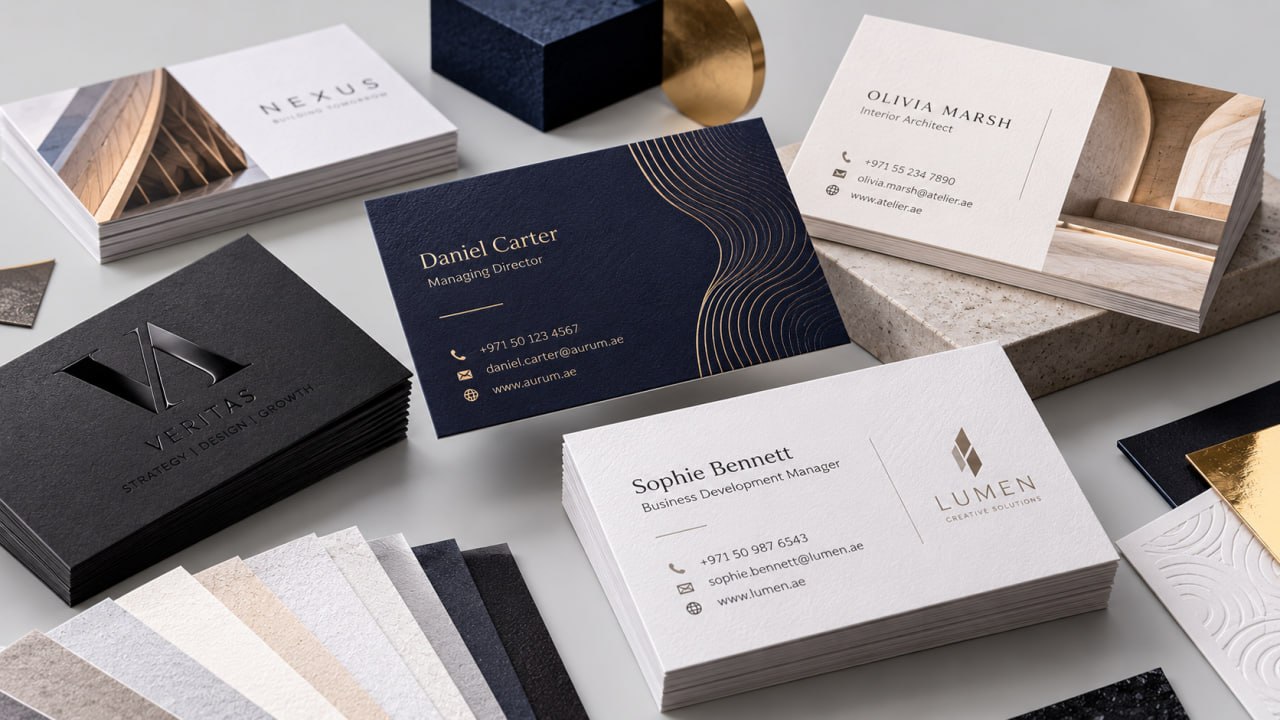
Business cards often work well with one controlled visual or tactile detail: matt lamination with spot UV, a carefully selected uncoated stock, or a restrained foil treatment.
Brochures and catalogues may place greater emphasis on durability and handling. In many cases, protecting the surface is more useful than adding several decorative processes.
Premium packaging provides more opportunities to combine techniques because surface, structure and brand presentation all contribute to the experience. Foil, embossing, special papers and die cutting can work together when each has a clear role.
Exhibition materials need to be considered in relation to lighting and repeated handling. A highly reflective surface may attract attention but can also create unwanted glare under directional lighting.
Presentation folders and corporate materials often benefit from restraint. A controlled contrast, tactile paper or carefully positioned logo treatment can communicate quality without making the design visually crowded.
Dubai adds another practical consideration
Commercial print in Dubai is frequently used in environments where materials are handled intensively, including exhibitions, conferences, corporate events, hotel settings, property presentations and retail environments.
The conditions in which a printed item will be used therefore deserve as much attention as its appearance. A brochure carried around at an exhibition for several hours has different requirements from a presentation folder that is opened briefly in a meeting. A catalogue displayed under strong directional lighting may need a different surface treatment from material intended for an office environment.
This does not mean that one finish is inherently better for Dubai. It means that handling, lighting, durability and visual impact should be considered as part of the same specification.
How to brief a printer about finishing
A useful production brief describes the result rather than simply naming a finish. For example:
- protect a brochure that will be handled repeatedly;
- make the logo visible against a matt surface;
- create a tactile brand mark;
- give packaging a metallic accent;
- produce a distinctive die-cut shape;
- reduce glare while preserving strong image reproduction.
This gives the production team a practical objective and makes it easier to assess paper, printing method and finishing as one connected system.
The most effective finish is the one with a clear role
Good finishing does not draw attention to the production process for its own sake. It supports the purpose of the printed piece.
Sometimes that means a protective matt laminate. Sometimes it is a small area of spot UV, a single foil detail or an embossed logo on an appropriate stock. In other cases, the most important finishing operation may be a crease, fold or die cut that allows the product to function correctly.
The strongest specifications are usually the ones in which paper, printing, structure and finishing have been considered together from the beginning. The result is not simply a more elaborate printed piece, but one whose physical qualities support the way it will actually be used.