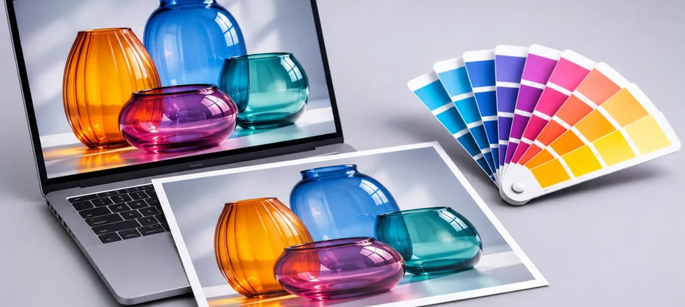
Colour Models: Principles of Encoding and Applications
In digital design, printing and photography, colour must be described mathematically. Standardised encoding systems are used to ensure that visual information is represented accurately for both digital devices and human vision. A colour model is a system for digitally representing colours using numerical values. Each system provides an abstract framework that assigns a unique set of coordinates to every colour. This gives software and hardware the information needed to determine the exact colour at any point in an image.
It is important to distinguish between a colour model and a colour space, although the two terms are sometimes used interchangeably in professional contexts. A colour model defines the general principle of representation, such as the way primary components are mixed. The additive RGB model, for example, describes how red, green and blue light combine to produce different colours. A colour space is a specific implementation of a model with defined parameters. Several colour spaces can be based on the same model, each covering a different range of reproducible colours, known as its gamut. Understanding this distinction is essential for professionals: selecting an unsuitable colour space, even when using the correct model, can result in data loss and inaccurate colour reproduction.
Colour models bridge the gap between human colour perception and the technical limitations of devices. The human eye can distinguish millions of colours, but devices can reproduce only a portion of them. Encoding systems standardise how colours are represented, helping to ensure consistent, predictable results.
Applications of Colour Encoding Systems
Colour models are used across all industries that work with visual information. In the digital world, devices with displays, from smartphones to professional monitors, produce images by emitting light. They use the additive colour system, in which colours are created by combining different amounts of light. This is the principle behind the RGB model. Each screen pixel consists of subpixels whose light intensity can be adjusted.
Printing works on a fundamentally different principle. When printing on physical materials such as paper, card, plastic and textiles, colour depends on how light interacts with the pigmented surface. The surface absorbs some wavelengths of light and reflects others back to the eye. This process is known as subtractive colour mixing, and the CMYK model is designed for this purpose. Printing requires precise colour reproduction because pigments interact with light differently from the way light itself behaves. Choosing the wrong colour model can result in printing errors and financial losses, particularly on large print jobs.
Photography combines elements of both fields. Professionals work with digital source files and physical prints. Since cameras capture light, images are initially represented in RGB. However, artwork intended for printing needs to be converted to CMYK. Photographers also use the Lab colour model for colour correction, with lightness and colour adjusted independently.
Web design and interface development focus on content viewed on screens. RGB is the dominant colour model in this field and is widely used by web browsers and operating systems. Designers must ensure that their layouts display correctly across different devices. Monitor calibration varies between users, but following RGB standards helps minimise visual discrepancies.
Scientific research and medical imaging also make use of colour systems. In cartography and satellite monitoring, multichannel models can represent data beyond the visible spectrum. Infrared data, for example, can be mapped to visible colours for analysis. In industry, machine vision systems use colour models and image data to detect defects automatically on production lines. In everyday life, we interact with these systems without necessarily realising it. Adjusting a television or choosing paint for the walls involves principles related to colour representation. Understanding the physics of colour helps us make informed choices about the tools we use. Knowing that a display emits light while paper reflects it explains why on-screen colours can appear brighter than those in a printed image.
Main Types of Colour Models
Several fundamental systems are used to represent colour, each designed to meet specific technical requirements.
RGB
The RGB (Red, Green, Blue) model is the dominant colour model in digital technology. It uses an additive process based on combining light. When all three channels are at maximum intensity, they produce white light. When all three signals are switched off, the result is black, as no light is emitted.
The system is based on the physiology of human vision: the eye contains receptors sensitive to these three ranges of the visible spectrum. The combination of these spectral ranges gives rise to the perception of other colours. Each channel is encoded digitally using numerical values. In an 8-bit format, the range is 0–255. Pure red is represented as (255, 0, 0). Combining red and green produces yellow, green and blue produce cyan, and red and blue produce magenta.
This model is used in all types of display devices. Its advantages include high brightness and a wide colour gamut. However, colour reproduction depends on the device: different displays may render the same RGB values differently because of variations in their panels and backlighting. Hardware calibration is essential for professional colour accuracy.
CMYK
The name comes from the four inks used in the model: Cyan, Magenta, Yellow and Key (black). CMYK follows the subtractive principle. In print, black corresponds to the highest ink density, while white is the colour of the substrate itself, where no ink is applied.
Four channels are used instead of three because, although cyan, magenta and yellow should theoretically combine to produce black, in practice the chemical limitations of printing inks result in a muddy brown tone. A separate black channel, known as Key, produces a deeper black, improves contrast and reduces the amount of coloured ink required. Each channel is expressed as a percentage of ink coverage, ranging from 0 to 100%.
Commercial printing is based largely on the CMYK standard. Both offset and digital printing use colour separation, dividing an image into four channels. Each ink is applied separately, making accurate registration essential. The CMYK colour gamut is narrower than that of RGB. Some vivid neon colours that can be displayed on a screen cannot be reproduced using standard CMYK inks.
Lab
The Lab colour model was developed to reduce dependence on individual devices. It represents colours according to human perception, regardless of the technical limitations of monitors and printers. It has three channels: L, representing lightness; a, representing the green-to-red axis; and b, representing the blue-to-yellow axis. One of the main advantages of Lab is its broad gamut, which encompasses the entire visible spectrum. This makes it a useful tool for advanced colour correction, as professionals can adjust lightness without directly altering colour saturation or hue.
HSB
Designed for ease of use, HSB (Hue, Saturation, Brightness) relies on concepts familiar to creative professionals. Hue determines a colour’s position on the colour wheel, Saturation indicates its purity, and Brightness represents its perceived brightness. This approach is used in the colour pickers of graphics editing software. Artists often find it more intuitive to adjust saturation using sliders than to manipulate numerical channel values. Although the software stores colour data in RGB or CMYK, the interface can use HSB to make colour adjustments easier.
Pantone
Pantone is a catalogue of reference colours. Each shade has its own identification number and a specified formula for mixing the base pigments. In commercial printing, the system is used for spot-colour printing. Unlike CMYK, where colours are reproduced using a halftone screen, the ink is prepared in advance to produce the required hue, ensuring a precise match to the reference colour.
Choosing the Right Colour Model for Professional Work
Choosing the right colour model is essential to the technical success of a project. An error during document setup can result in the work having to be redone.
For Graphic Designers
Graphic designers working in visual communications must consider both digital and physical media to achieve the intended output. When designing a logo for both digital and print use, vector graphics are preferable. If print is the priority, the work should begin in CMYK; if the design is intended for screens, RGB is the better choice. For print projects, it is generally advisable to create the master artwork in CMYK, as conversion from CMYK to RGB tends to be less problematic. A separate export can then be prepared for online use. The key is to establish the intended applications with the client from the outset.
For Illustrators
Illustrators create artwork for a wide range of purposes. Printed publications require a colour profile that meets the printer’s specifications, usually CMYK. RGB is used for content intended for social media and gaming projects.
For Photographers
Photographers capture light, so RGB is their primary working model. Lab is well suited to portrait retouching, as skin imperfections can be corrected without altering natural skin tones. The choice of colour model depends on the stage of the workflow.
For Web Designers
Web designers work exclusively in the digital domain. Their primary standard is RGB, specifically the sRGB colour space, which is fundamental to web content. Other profiles may result in colours being displayed inaccurately in browsers. Since visitors may use uncalibrated screens, designers should favour colours with sufficient contrast.
Guidelines for Converting Between Colour Models
Converting between colour models, particularly from RGB to CMYK, presents a risk of data loss because the models have different colour gamuts. Vivid blues and greens in RGB often fall outside the CMYK gamut. During conversion, these colours are replaced with the closest available alternatives, resulting in reduced saturation. To minimise colour loss, follow these guidelines.
Avoid converting images to CMYK too early. Work in RGB for as long as possible to take advantage of its wider colour gamut. Convert the image at the final stage, just before print production. Modern graphics software offers a Proof Colours function, which simulates on screen how colours will appear in print without altering the original file.
Use the correct conversion profiles. Ask your printer which ICC profile they use and apply that profile to ensure the best possible colour match. It is also important to monitor the total ink coverage (TIC). For offset printing, this is usually limited to 280–300%. Exceeding this limit can prevent the ink from drying properly and cause the image to smudge.
Pay particular attention to black. In RGB, black represents the absence of light (0, 0, 0). In CMYK, it can be produced using black ink alone or a combination of inks. For text, use pure black (0, 0, 0, 100) to avoid registration problems. For deep, dark backgrounds, rich black can be used — for example, 60% cyan, 40% magenta, 40% yellow and 100% black — but only across large areas.
Always inspect the image visually after conversion. Automatic conversion can sometimes make an image look flat. If this happens, adjust the curves or levels manually in CMYK mode. It is also worth printing a colour proof on the same material intended for the main print run, as paper can significantly affect how colours appear.
If certain colours must match precisely, consider using Pantone spot colours instead of converting them to CMYK. Understanding how colour models work and carefully managing conversion settings helps preserve image quality across different media.