
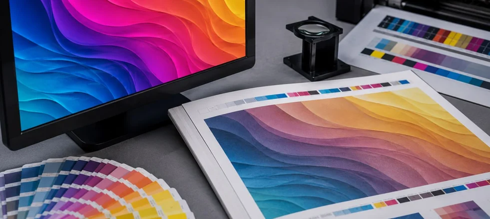
CMYK vs RGB for Printing: Why the Colours You Approve Aren't Always the Colours You Print
Everything looked perfect during the approval meeting. The product catalogue displayed bright blues, vivid greens and rich gradients on every screen in the room. Yet when the printed copies arrived, the colours looked noticeably different. The design hadn't changed, the printing press hadn't failed and the paper was exactly as specified.
The problem began much earlier—before the file ever reached the printer.
One of the most common reasons for unexpected colour shifts is a misunderstanding of how digital screens and commercial printing reproduce colour. Although designers, marketers and printers all talk about "colour", they are often working with two completely different systems.
A Screen Creates Colour; A Printing Press Reproduces It. When people compare RGB and CMYK, they often focus on the abbreviations themselves.
In practice, the more important difference is how each system creates an image.
A monitor produces colour by emitting light. Every photograph, logo and illustration is built from combinations of red, green and blue light, allowing screens to display exceptionally bright and vibrant colours.
Printing works differently. A press cannot generate light—it applies tiny layers of cyan, magenta, yellow and black ink onto paper. The final colour depends on how those inks interact with each other, with the paper surface and with the surrounding light.
Because these two technologies work according to different principles, they will never reproduce every colour in exactly the same way.
Why Some Colours Look Different in Print
Many of the colours that stand out on a digital display simply cannot be recreated with standard printing inks.
Bright neon greens, highly saturated blues and certain luminous oranges are good examples. They exist comfortably on a screen but fall outside the colour range available in conventional CMYK printing.
When artwork prepared in RGB is sent to print, those colours must be converted into printable values. The printing software searches for the closest possible match, but the closest match does not always mean an identical result.
This is why colours that looked vivid on screen sometimes appear softer or slightly darker once they are printed.
The Real Mistake Isn't Designing in RGB
There is a common belief that professional designers should always work in CMYK from the very beginning. In reality, many creative teams develop layouts, edit photographs and create illustrations in RGB.
Modern design software is optimised for digital displays, making RGB a practical colour space during the creative stage. Problems usually arise later, when no one checks how the design will behave after conversion to CMYK.
Professional print production is not about avoiding RGB entirely. It is about understanding when the project must transition from a digital colour space to one that accurately reflects commercial printing.
Colour Accuracy Depends on More Than CMYK
Changing a file from RGB to CMYK does not guarantee perfect colour reproduction. The printed result is also influenced by the paper stock itself. Glossy coated stock reflects light differently from an uncoated matt sheet. Ink density, finishing techniques, printing technology and even the lighting conditions in which the product is viewed all contribute to the final appearance. This is why experienced print providers evaluate colour as part of the entire production process rather than treating the colour mode as an isolated technical setting.
When Colour Consistency Becomes Critical
For some projects, slight colour variation is unlikely to affect the overall result. A promotional flyer or event leaflet may still achieve its purpose even if certain shades appear slightly different. For other products, colour accuracy is essential.
Luxury packaging, branded stationery, corporate identity applications and premium catalogues often rely on precise colour consistency. Even a small variation can weaken brand recognition or create inconsistencies across different printed materials. In these situations, printers frequently recommend reviewing colour proofs before approving the full production run. Identifying potential differences at this stage is considerably easier—and less expensive—than addressing them after thousands of copies have been printed.
Good Print Starts Long Before the Press
Successful printing is not determined by the printing press alone. It begins with decisions made during artwork preparation. Understanding the difference between RGB and CMYK allows designers and businesses to anticipate how colours will behave before production starts. Instead of being surprised by changes after printing, they can adjust the artwork while revisions are still simple and cost-effective.
The objective is not to force every project into a particular colour mode. It is to ensure that the file reflects the realities of commercial printing. When designers and print specialists work with the same expectations, the finished product is far more likely to match the original creative vision.