Business Cards for Business: How to Choose Paper, Size, Finish and Design
The format, paper, finish and design all influence the finished business card — from how it feels in the hand and how easily the information can be read to its overall visual impression. The paper affects colour reproduction and surface appearance, the format determines how the information can be arranged, and the design needs to work with the characteristics of the chosen stock and printing process. The most reliable approach is to make these decisions together. The amount of information, the intended visual character and the way the cards will be used all influence the final combination of size, paper, colour, printing and finish.
Choosing the Right Business Card Size
The familiar rectangular format remains popular because it is practical. It fits easily into wallets, card holders and desk organisers while providing enough space for a name, job title and essential contact details.
There is no requirement to use exactly the same proportions for every business card. A narrower, more elongated format or a more compact shape can support a particular visual identity when it suits the design. The amount of information matters here as well. A card carrying only a name, role and telephone number has very different space requirements from one that includes several contact methods, a long job title, a website and a QR code.
The finished dimensions should be established before the artwork is developed. This allows the layout, margins and typography to be designed around the actual proportions of the card rather than adjusted afterwards.
Choosing the Right Paper for a Business Card
The paper determines the surface onto which the ink is printed, so it affects colour, detail, texture and the way the finished card feels in the hand.
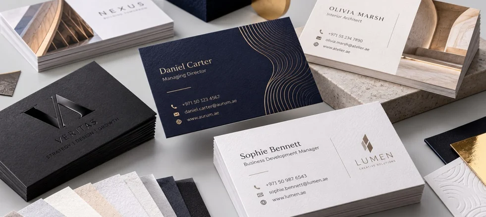
Coated paper has a smooth surface that generally allows fine details and colour transitions to appear clearly. It can work particularly well for photography, detailed graphics and designs that rely on strong visual contrast. Uncoated paper has a different surface character: its texture is more noticeable both visually and to the touch, so the paper itself becomes part of the impression created by the card. Speciality and textured papers can introduce another visual or tactile element. They can be effective when used deliberately, but their properties need to be considered alongside the artwork. A pronounced texture, for example, can affect the appearance of fine lines and small type, while a coloured stock changes how printed colours are perceived.
The choice between coated and uncoated paper should therefore be based on the intended appearance of the card, not simply on a preference for one surface over another.
Choosing the Right Paper Weight
Paper weight is often used as a quick way of comparing business card stocks, but a higher GSM is not automatically a better choice. A lighter stock can be practical when cards are exchanged in large quantities at exhibitions, conferences or sales meetings.
A heavier stock creates a more substantial feel and may be appropriate when the physical character of the card is important to the overall presentation.
Weight should also be considered alongside the construction of the paper. Two stocks with a similar GSM can feel quite different in the hand because of differences in stiffness and composition. GSM is therefore useful as a specification, but it should not be treated as the only measure of quality.
Colour and Printing Need to Be Considered Together
Colour can behave differently on different papers, particularly when the design contains large solid areas or very dark backgrounds. What appears on a monitor is not an exact preview of the printed result, because the final appearance depends on the paper, ink coverage, colour specification and printing process.
Dark designs deserve particular attention. Large saturated areas can make fingerprints, handling marks and some surface variations more noticeable, especially on smooth finishes. If a dark colour or full-coverage background is central to the design, the paper and finish should be selected with it in mind.
Colour should therefore be judged as part of the printed design rather than as a purely digital choice.
Choose Finishing for a Reason
Finishing can change both the appearance and tactile quality of a business card, but each treatment should have a clear role in the design.
Lamination changes the surface and can provide additional protection. Matt and gloss finishes create different visual effects, while soft-touch lamination gives the surface a particularly smooth feel. The result depends on how the chosen finish works with the paper, colours and artwork. Finishing can also be selective. A particular treatment may be used to emphasise a logo, name or graphic detail while leaving the rest of the card relatively restrained. This can create a more controlled result than applying several effects across the entire surface.
Foil and Embossing Should Be Planned from the Start
Foil stamping and embossing are not simply decorative additions that can be placed on top of a finished design. Their position, size and level of detail need to be considered while the artwork is being developed.
Very small lettering, fine lines and complex shapes may require a different approach from ordinary printed elements. The surrounding space matters as well, because a foil or embossed detail needs enough room to remain clear rather than becoming lost in a crowded composition.
Used selectively, these techniques can provide a strong focal point. A small metallic detail or carefully positioned embossed element can sometimes have more impact than several finishing processes used together.
Design for the Finished Size
A business card offers limited physical space, so visual hierarchy is essential. The name, role and contact details should be easy to locate, while decorative elements should support the information rather than compete with it.
Typography needs to be assessed at its actual printed size. A typeface that looks comfortable on a large screen can become too small or dense once reduced to business-card dimensions. Margins and empty space are equally important, because too much information can quickly make a small format feel crowded.
The design should also take the printing process into account. Very fine lines, small reversed type and light text placed over dark backgrounds may behave differently depending on the paper and production method.
Using Both Sides Effectively
Printing on both sides provides more space, but the reverse should have a defined purpose rather than simply being filled because it is available.
One side may prioritise the person's name and contact details, while the other carries the company identity, website, a concise service description or a QR code. Alternatively, leaving the reverse largely empty can be an intentional design decision when a clean, minimal appearance is more appropriate.
The useful question is not how much information can fit on both sides, but what the recipient actually needs to see, read and remember.
QR Codes Must Work at Their Final Size
A QR code can be useful on a business card for directing people to a website, contact page, digital profile or booking system. Because it is a functional element, it needs to be treated differently from purely decorative graphics. It needs sufficient size, contrast and clear space around it, and its position should not interfere with the rest of the layout. Most importantly, the printed code should be tested at its finished size rather than relying only on a digital preview.
Design and Production Belong to the Same Process
A business card is both a piece of graphic design and a physical printed object. The artwork affects production, while the selected paper and finishing affect how that artwork will look in the finished card. This matters particularly when a design combines large solid areas, fine typography, textured paper, foil, embossing or several finishing processes. Considering these characteristics before the artwork is finalised helps avoid unnecessary changes and gives the production team a specification that can be executed as intended.
When Simplicity Produces a Better Result
A more elaborate specification is not automatically a more effective one. Thicker paper, multiple finishes, metallic foil and embossing can each contribute something useful, but combining several effects without a clear visual reason can make the card feel unnecessarily complicated.
Often, a strong result comes from a small number of well-matched decisions: a paper with the right surface and weight, a clear typographic hierarchy, an appropriate colour treatment and one finishing process that supports the design.
Cost Should Follow the Specification
The cost of business cards depends on the combination of factors used in production rather than on paper weight alone. Quantity, format, paper, colour coverage, printing method, finishing and additional production processes can all affect the final price.
The specification should therefore reflect how the cards will actually be used. A large quantity intended for regular distribution may call for a practical combination of materials and finishing, while a smaller quantity for important meetings may justify a more distinctive paper or a particular finishing process. The aim is not to make the specification as elaborate as possible, but to ensure that each production choice has a clear purpose.